
The 5-30 seconds rule for charts and dashboards
Design visualisations that will make your life easier and more productive by not making you think.
The 5-30 seconds rule is something I aspire to every time I'm designing a chart or a dashboard. It goes like this:
A visualisation should allow you to:
One, understand if things are on track in less than 5 seconds.
And two, find out where they're not within the next 30 seconds.
Who wouldn't appreciate visualisations like that? If "Don't make me think" is a good general design principle, visualisations should adhere to it as well. Imagine how easy it would be to stay on top of things if our charts and dashboards followed this rule. It looks simple, right? But that simplicity can actually be quite demanding.
Let's illustrate this with an example. At a previous company, we had the following commitment:
"All services belonging to your team should meet a 99.9% availability or more."
Engineering Managers were accountable for meeting this score. To reinforce the commitment, we focused on making it straightforward to visualise on their team dashboards. Each team had a Looker dashboard where they could track certain goals and KPIs. These dashboards were limited in space, meaning that showing one chart per service would be impractical.
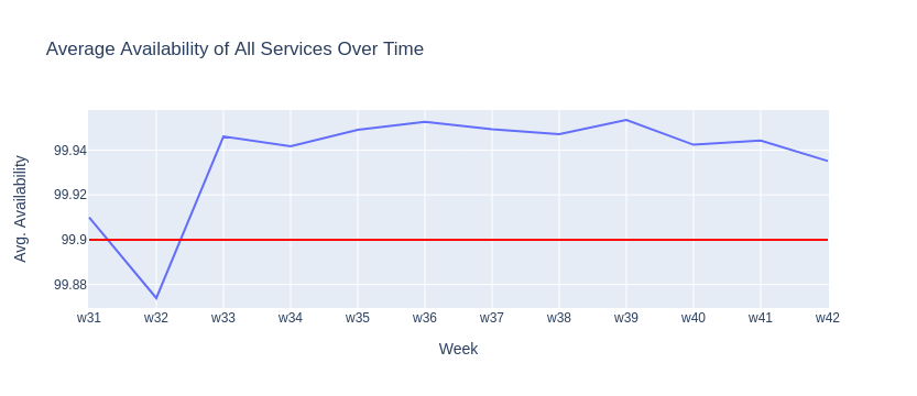
Averaging availability for all services in one single chart wouldn't work either. If your team managed ten different services and one of them was severely impacted, the average could still be above the success threshold, effectively hiding crucial information. This would violate the 5-second part of the rule.
But what if, instead of averaging availability, we displayed a stacked area chart showing the count of services that comply with the target score? If we used green to indicate the number of services that comply, and red for those that don't, it would be straightforward to see if we are on track. This would satisfy the 5-second part of the rule.

That was easy, right? But what about the 30-second rule? This is where things get interesting and creative. There are several valid solutions, such as listing the failing services when you hover over the markers in the chart. But one of my favourites is:

By displaying a heat-map of the availability score of each service over a period of time, it becomes straghtforward to see which services are performing well and which aren't, as well as when. By showing compliant services with a shade of lime while non-compliant in red, it is now evident how Service A was acting up a few weeks ago, while Service B requires attention.
You could even take it further and link each cell to the specific view for that service for that period within your monitoring tool, making further investigation smooth and painless.
This indeed requires time and effort. But with the power of tools like JupyterLab and ChatGPT it's becoming easier and faster. Each of the charts above took less than 50 lines of code to write and something about 20 minutes each. You can find them in this repository.
As you can see, the 5-30 seconds rule can act as a catalyst for better visualisations—visualisations that make our lives easier and more productive.

I'm a fractional CTO that enjoys working with AI-related technologies. I have dedicated more than 15 years to serving SaaS companies. I worked with small startups and international scale-ups in Europe, UK and USA, including renowned companies like Typeform.
I now work helping startups achieving high growth and performance through best practices and Generative AI.